Hi everyone,
Welcome to another article on a topic we don’t cover often enough: how we design mechanics for Caliber. Last time, we talked about providing information during combat, and today we’ll take a deeper look at one of the tools used for that purpose.
The HUD (heads-up display) has been an integral part of video games for a very long time. Even Pong in 1972 had a HUD, with numbers representing the score.
Over the decades, video games have evolved, and gameplay has been expanded with new mechanics and objectives. This necessitated changes to the HUD as well, so that players could more easily understand what was happening on the screen.
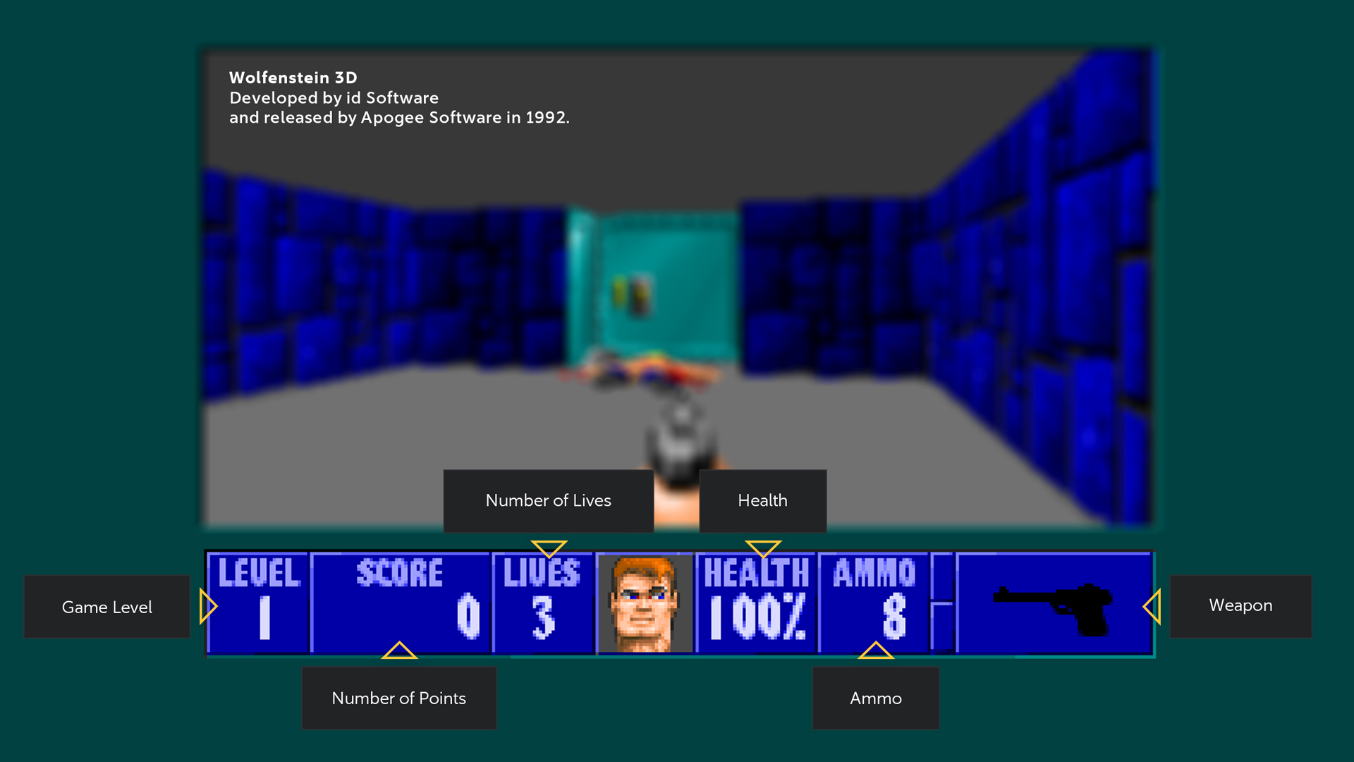
In many modern games, including first-person shooters, players need to keep track of much more than just their aiming reticle, enemy positions, health, and ammo. Developers often add markers for objectives and points of interest, a compass and a minimap to help with navigation, icons for active effects, healing and damage indicators, and much more.
Caliber is no exception. At the moment, the game features 72 operators with unique skills, 9 active modes with their own objectives and victory conditions, and maps containing interactive objects. All of this has to be visually conveyed to the player—and that’s where the HUD comes in.
In very simple terms, the HUD in Caliber displays operators’ stats and the combat objectives. Development of Caliber started back in 2015, and since then the HUD has changed a lot. Today, we’re going to take a closer look at it.
We designed our HUD early in development, and have been updating it ever since. Most development aspects of Caliber are subject to iteration: we design a new mechanic and then continue to improve upon it.
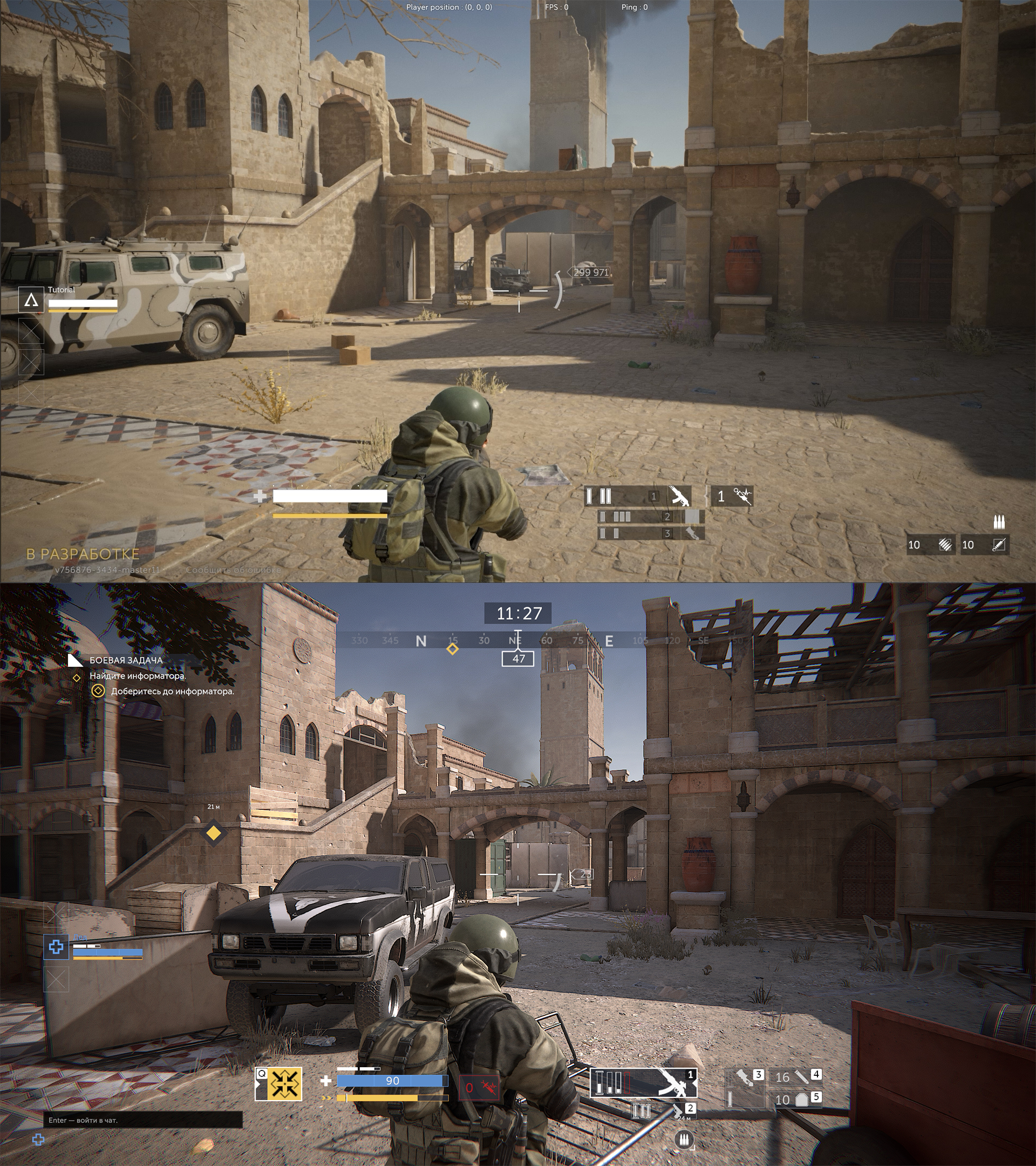
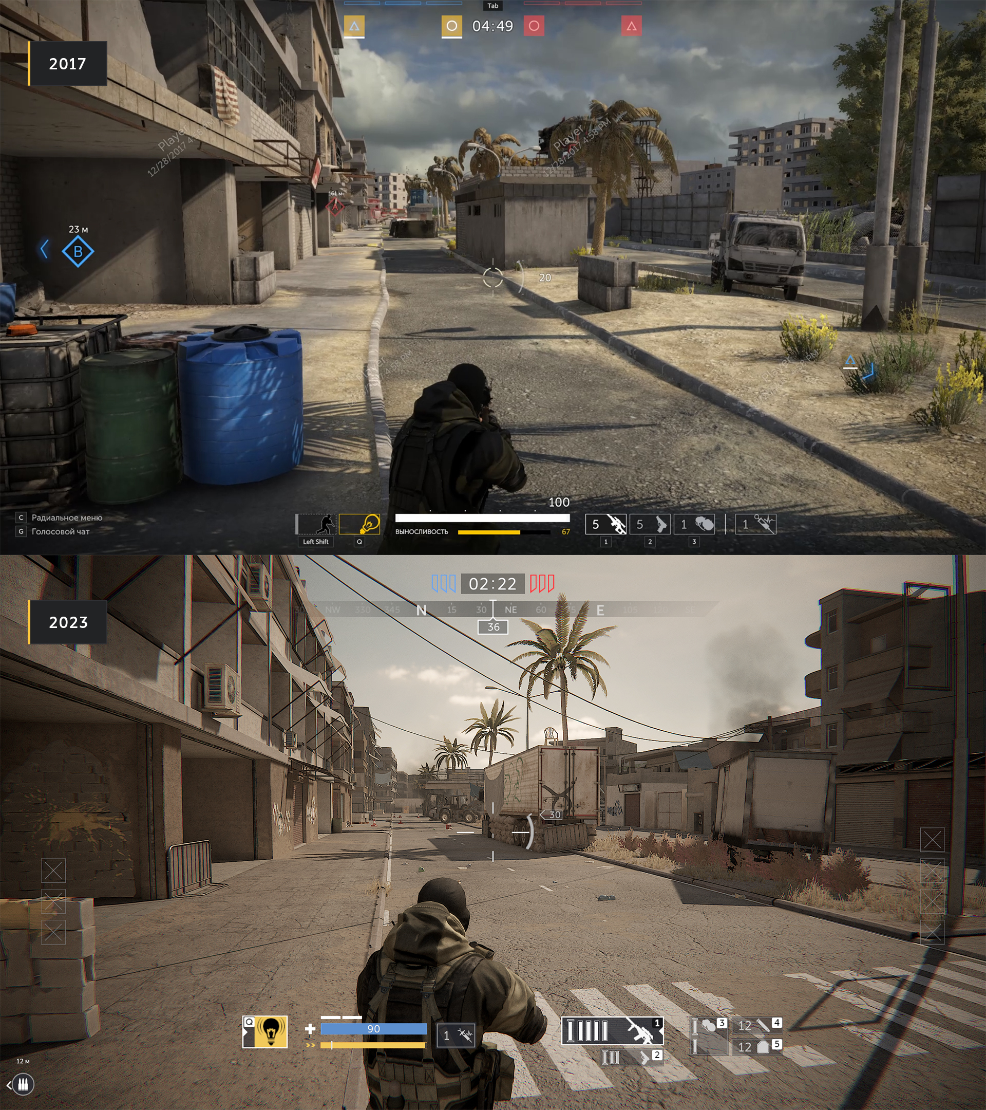
We tested various versions before we landed on the one we use now. For example, we experimented with adding a minimap and placing operator portraits at the top of the screen. But our tests showed that this approach, while fitting for many other games, didn’t work for us. We’ll explain why in a bit.
The current HUD in Caliber is the result of trial and error — something that is unavoidable when aiming to create a specific player experience.
It’s important to understand that the HUD elements and their placement have a direct impact on gameplay. If the player receives too much information, they will stop interacting with their teammates and instead try to play solo.
Thus, whenever we make decisions around creating or changing HUD elements, we start off by thinking about what kind of experience we want to create for the player. In our case, it’s always an experience built around teamwork.
Every HUD element occupies screen space. Its size determines how much information it can convey and how noticeable it will be.
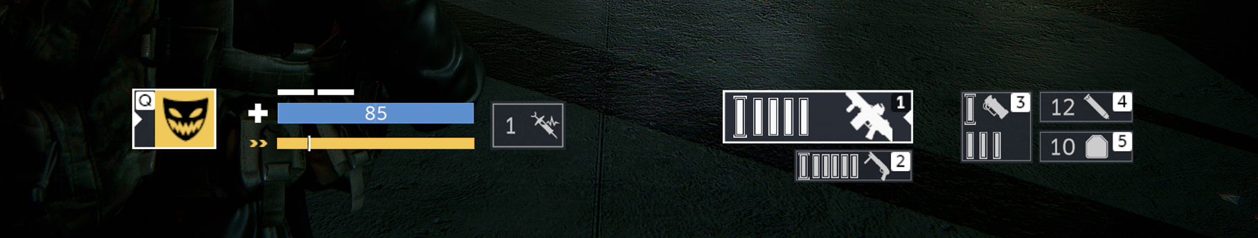
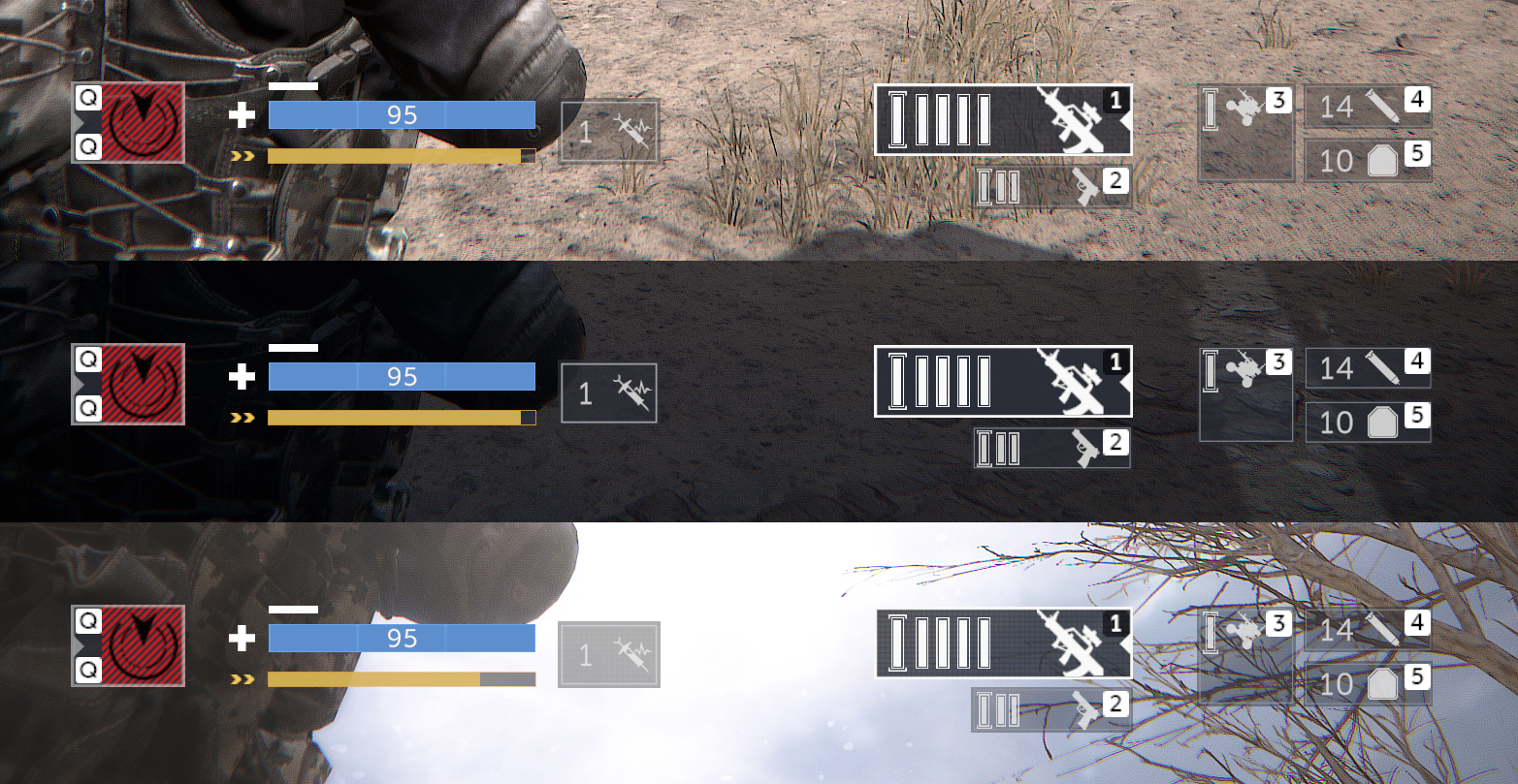
The placement of elements is also important. The closer an element is to the center of the screen, the more attention it will draw. That’s why we placed the most important elements at the center: the operator’s HP, stamina and ability, as well as stats for their weapons, ammo and reserves.
The other key aspect is dynamics: static elements are always harder to notice, no matter the size.
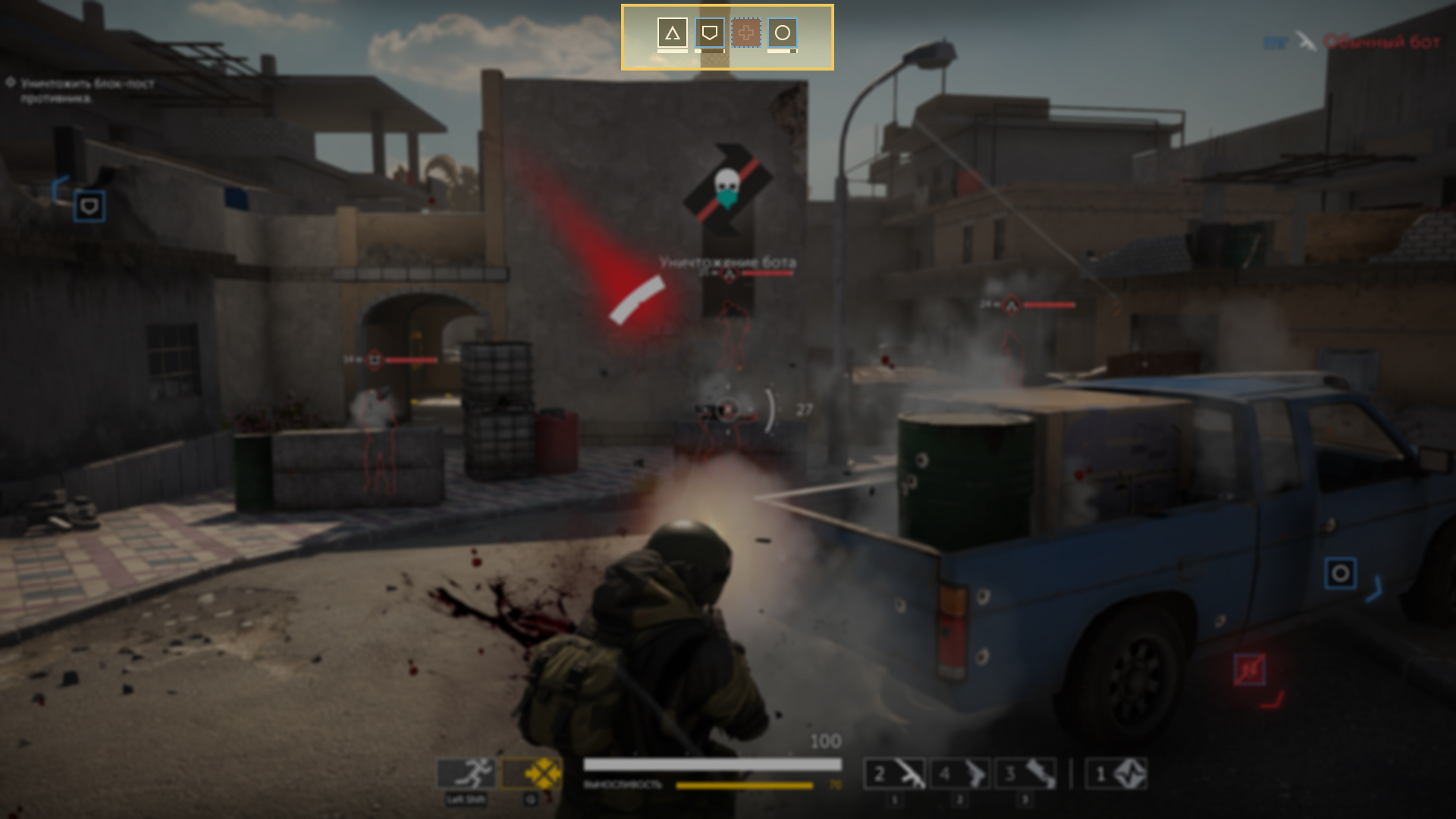
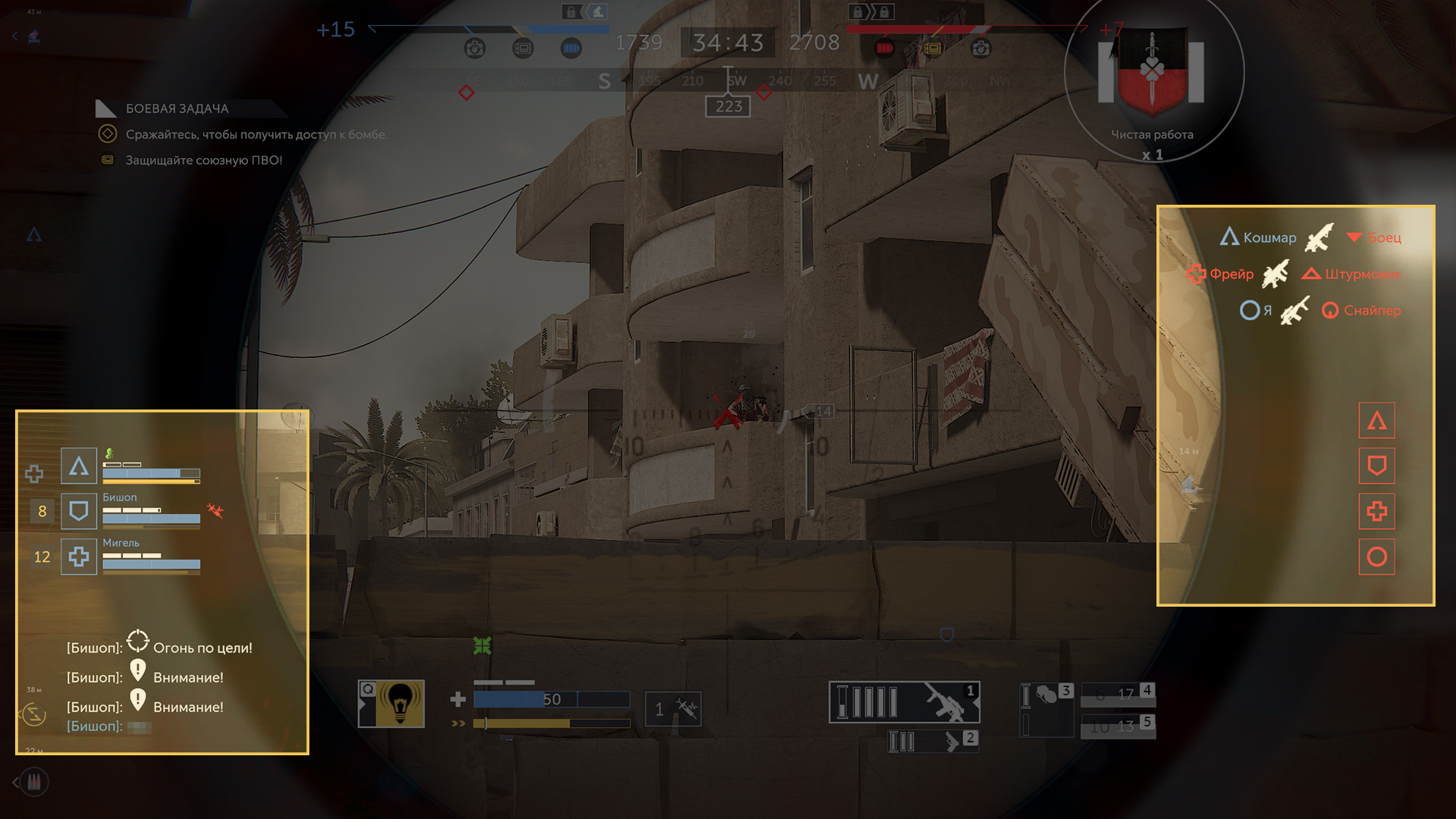
We divided the screen into four thematically distinct zones.

As a result, we have side-by-side information on the teams, and at the center we can see information on the operator and the flow of combat.
As mentioned earlier, we initially tried to imitate how other games distribute information in their HUDs. You can see this in screenshots of the old prototype.
But Caliber is a team-based game, which means we have to convey more information.
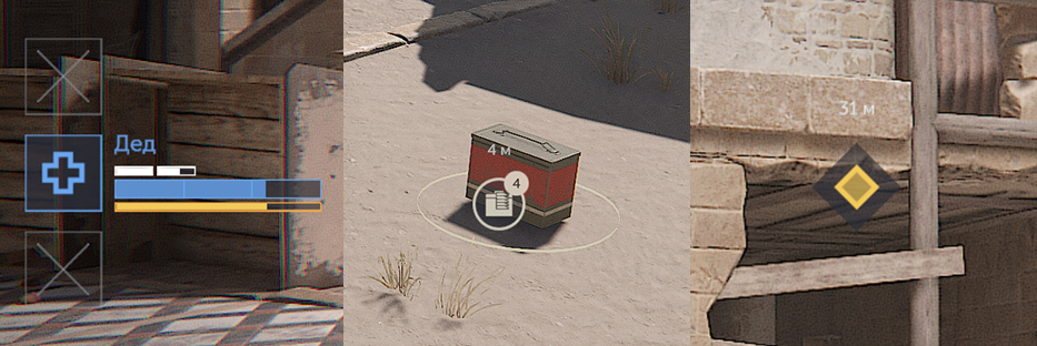
We had to split the panel to free up more space for the HUD, which allowed us to add vital information about HP, and the positive and negative effects on your allies. It was impossible to organically integrate teammate HP bars at the top of the screen.
You can see a similar approach being used in other games that are heavily focused on team play.
By taking a closer look at the bottom panel with operator information, the logic behind the placement of these elements becomes clear.
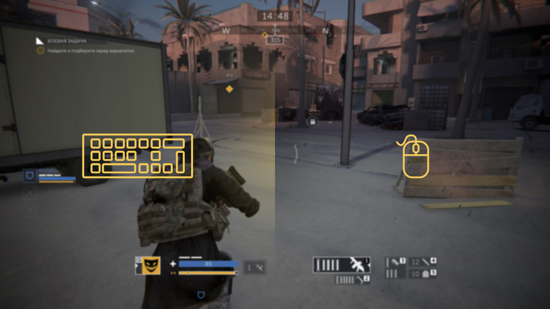
Most players have their mouse on the right side of their desk, and their keyboard on the left side. The elements that display operator information imitate this configuration.
The keyboard is used to move the operator, so key information is placed on the left side. The mouse is used to aim and shoot, so weapon information is on the right.
Other HUD elements are also placed next to things they’re related to. The chat is placed next to the allied team stats, while the kill feed is placed next to the information about the enemy team — the «negative» zone.
As a result, the information is easy to parse, and the HUD can be navigated intuitively.
A dynamic element always attracts more attention than a static one. When considering dynamics, the size of the element doesn’t matter so much.
During active combat, we aim to draw the player’s attention to important elements with flashes and other animations.
UX testing has clearly shown that players will ignore certain UI elements unless they’re animated and highlighted.
The color of every HUD element plays a huge role. You cannot paint everything a single color. For Caliber, we chose a specific color scheme with a clear set of meanings.
For example, green represents healing, which can be categorized as positive. But we can’t use it for teammates, otherwise everything will blend together.
The starker the color difference between elements, the easier it is to track information.
It’s also important to keep in mind that not all players perceive colors the same way. Some have a limited ability to distinguish colors. That’s why the game offers two additional color schemes: Special and Alternative.
When it comes to HUDs, readability requirements are very high. When designing the HUD, every element has to be checked against multiple backgrounds: light, dark, and mixed.
Information has to be carefully portioned. Too many visuals in the HUD is practically the same as having none, so we always aim to prioritize. The less important elements are smaller, dimmer and less dynamic, and the opposite is true of more important ones.
Sometimes, the player needs to know when something is absent, rather than when it’s present.
For example, when designing the elements that contain information about teammates, we could’ve chosen to display all of their current equipment all the time, but that would’ve resulted in a lot of visual noise.
Take the Revival Kit, for example: if a player has one, there’s no need to inform them about it, but they need to know when they run out. It’s just like a check engine light: it only needs to turn on when there’s a problem with your car.
The shape of HUD elements is another important aspect.
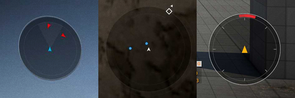
Some players ask us to add a minimap or a radar to Caliber, and often wonder why they’re not already in the game.
There are a few things to consider here.
1. The minimap is necessary if the game mode is built around dynamically changing conditions that the player has to constantly keep track of. For example, battle royale games with a constantly narrowing play area.
2. Minimaps are useful on large, complex maps that are hard to read and study naturally during gameplay.
This point doesn’t really apply to us, because we try to make our maps simple and easy to read.
3. The minimap conveys too much information and de-incentivizes teamwork. Indeed, it’s a useful and convenient tool, but only when the goal is to make a game that isn’t heavily focused on working with your team.
During UX testing we observed that, when having access to a minimap, players would stop exchanging information.
The value of communication drops and players begin playing solo, ignoring their team.
4. The minimap draws the player’s attention away from what’s in front of their operator.
Recently we released a new game mode, Threshold, which features many entities and objects. Keeping their positions in mind is rather difficult, so this is one mode where having extra information would be reasonable.
But even if we do implement a map, we will make it available in a separate window. The player will have to open a menu and put themselves in a vulnerable position in order to check their surroundings and plan their actions. The map will not be something that can be used to constantly monitor the situation.
The design of the HUD is also driven by the game’s perspective. Our game is in third person.
The UI designer has to take into account how often the area behind the HUD changes. For example, if the background remains mostly the same, then frequent flashes would be more distracting than useful.
At the same time, if something frequently changes behind the HUD (such as the constantly moving operator), its elements will have to be brighter and more dynamic.
So, the chosen camera perspective will have a direct impact on the efficiency of the game’s HUD. This doesn’t mean that the HUD from a third-person game wouldn’t work in a first-person one, but it’d be less effective.
The HUD is one of the most important sources of information for the player. Its design and contents are determined by how much of that information the developer wants to make accessible in order to shape the player’s experience.
It’s very possible that if you log into Caliber in six months, you will see a new HUD, because it’s one of those aspects of development that are never perfect and are always iterated upon.
We’ve only gone through the basics here. There are many other nuances related to the HUD beyond what we can cover in this article.
